Logo's. A brand's identity. It is everything your brand stands for, communicates, and resonates in a single icon. Pretty heavy huh? It seems like this is one of the biggest stumbling points of most brands. When they begin, they have to choose a logo. They spend so much time on it that they may never begin. My idea when I began is that I would start with my best one and change it if necessary over time. Today I am announcing my third logo change for Vaughn de Heart. Let's go over the brief history of my logo's. Walk with me down memory lane. There is a lot that I learned over the years with these logo's.
First logo

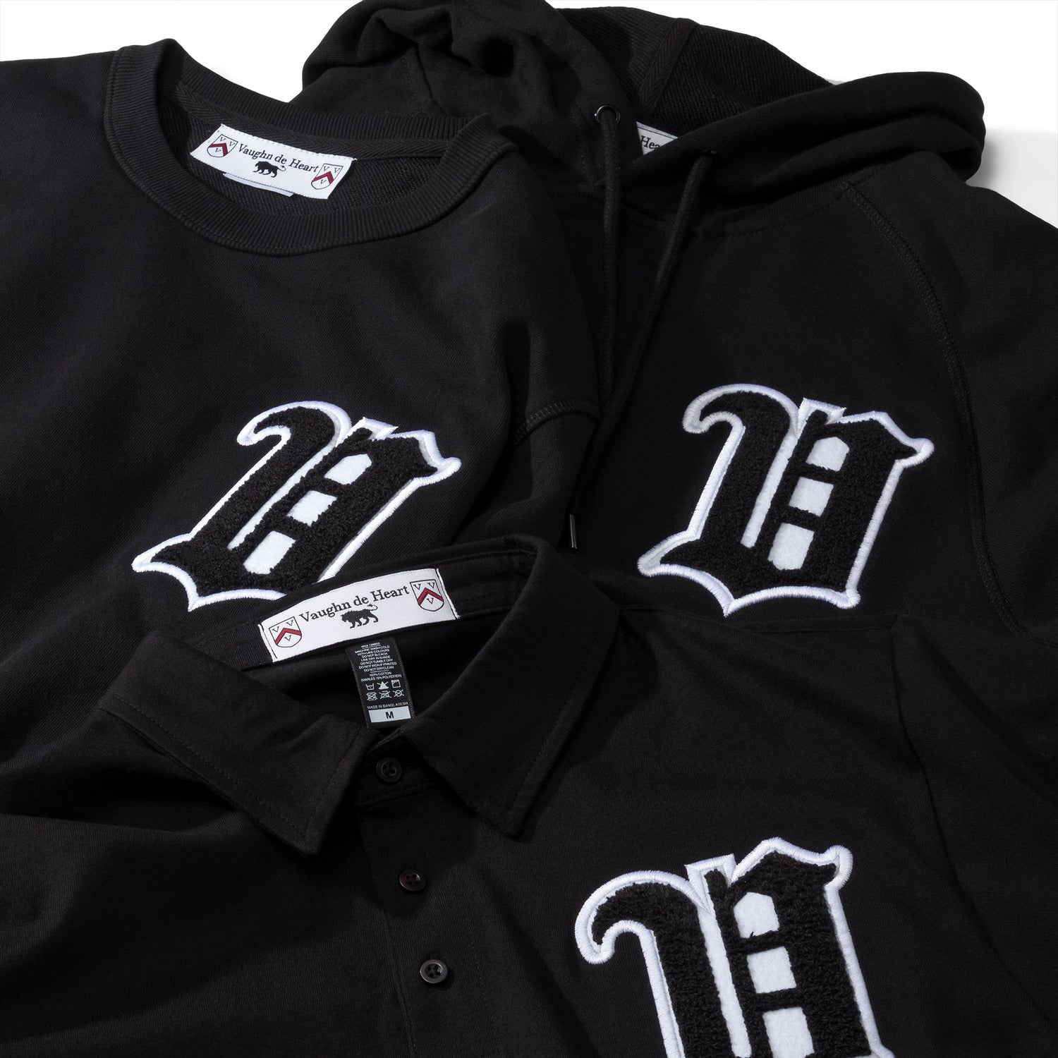
This is the logo that I came out of the gate with. Designed by myself. Man these were good times. For a lot of the time when this was my main logo I printed it on the sleeve of all of my designs. I liked this logo because I felt it embodied a lot of what I wanted my brand to originally be. Artistic, and foreign. I originally designed this logo to be only a, "VH." However after I started using it people told me that they saw a, "D" within the logo. This was something I didn't intend, but I was happy when people found something in the design that I didn't intend. When I stopped printing this logo on the sleeve of my designs some people were saddened. I thought it made my designs better, and cleaner, however people had grown attached. One nice thing about when I had this as a sleeve logo is that whenever I saw something printed on the sleeve of someone's shirt I would automatically check to see if they were wearing one of my shirts. And to my surprise sometimes they were. The sleeve logo was a big indicator. That part I miss about this logo. The biggest issue with this logo was that it didn't fit with my cleaner designs. If I had a clean san serif, or even serif text on a shirt this logo didn't seem to fit. It seemed to detract from the design.
Second logo

The, "Circle VH logo." That's what I called this one. This logo was not designed by me. The biggest thing that this logo has given me is cleanliness. This logo is very clean and can be put alongside most anything. It was much easier to slip this logo into designs and seemed to be a much better representatiton of my brand. However I remember talking with my brother. He was speaking with one of my childhood friends about my brand and they said they missed my original logo. I said, "Why? That logo was so hard to incorporate in so many place." He said, "Yes I know, but what they missed was how raw the old logo was, how fierce it was." I remembered scratching my head. How can I accomplish both raw and clean together in one. It's so hard. The toughest part of this logo is that you may not recognize what it is right away. For a lot of people I had to explain that this was a, "V" and an "H." They didn't get it right off the bat.
New Logo

Here is the latest logo from Vaughn de Heart. This is the logo that will be our main logo going forward. You may recognize it. I've been using this logo already on my shipping bags, and I used it a couple of times in the
La Mer colleciton. The reason I have chosen to go with this logo is because it is simpler. This logo fits criteria that my previous logos did not.
1. It contains no letters.
My previous logos tried to make you associate to my brand by the letters they represented. This logo does not. This logo associated to my brand by what it stands for. My brand has always been about courage and heart. A lion symbolizes that. Throughout all of literature lions are a symbol of courage, and fighting for what you want. This is what my brand already aligns with.
2. You can sketch it
You can draw this.
Bobby Hundreds once said that your logo should be drawable by a 5 year old. This logo I believe fits that criteria. You can draw this, yourself. I remember my friend Greg from southern California talking about how in elementary school all of the kids would draw the
Stussy logo in class in their notebooks. One reason is because it was simple enough to draw.
3. It is something we all know of already.
Everyone knows what a lion is. This logo is not of something that is abstract. You already have an association of what a lion is built in your mind. I am building upon that. I am associating my brand with a concept that is already in your head, which is a stronger place to start. I am remind of when Jeff Staple of
Staple Design talks about their pigeon logo. He is always saying how whenever anyone sees a pigeon they will immediately think of his brand. While that may not be true in every situation I have caught myself doing that. Also with the brand
Supreme, I have seen rental trucks from a completely unrelated rental van company. They say, "Supreme." on their mud flaps. It always makes me think of the Supreme brand. Also at a Mexican food stand they had a, "Supreme Burrito." Also made me think of the brand.
I love Batman the animated series. I own two of the three DVD sets of the entire series (The third one is still eluding me). In one of the special features they talk about how in the intro to that iconic cartoon they never say the word, "Batman." They never say that the show is about Batman in the intro. In fact the name is never shown on the screen until the ending credits. They say, "You already know what this is about." They know you have an understanding of what Batman is that is so powerful they don't have to tell you that you are watching it.
What I am hoping to accomplish with this logo is to associate my brand with all lions. Every time someone sees a lion I want them to think of my brand. Even when it is completely unassociated with my actual brand. When they are at the zoo, when they see a cartoon about a lion, anything. I want them to think of Vaughn de Heart. If they see a lion the name, "Vaughn de Heart" will not need to follow it. I hope that the lion alone will already make them think of it.